Helping Riders Find the Right Bike with Guided Wayfinding
Specialized’s bike catalog is broad, technical, and high-consideration. Riders often landed on a listing page knowing they needed a bike, but not knowing which category fit their riding style, terrain, or intent. As the UX lead working across product, design, and engineering, I helped reframe the page from a passive product grid into an active decision-making surface that guided riders to the right category faster.
The Challenge
The business problem looked simple on the surface: improve bike discovery. The real challenge was more nuanced. Riders were entering a complex taxonomy with unclear category differences, merchandising wanted stronger storytelling, product wanted measurable conversion impact, and engineering needed a reusable component that could scale well beyond a single page. We needed to reduce decision friction without slowing shoppers down or overwhelming them with more UI.
- Riders had a 'what should I buy?' problem before they had a filtering problem
- Bike categories were meaningful internally but not always obvious to customers
- The PLP experience optimized for browsing inventory, not orienting first-time or uncertain shoppers
- The solution had to work on the global homepage and nearly 50 product listing pages
- We needed a reusable pattern that merchandising, design, and engineering could all support
The Solution
I led the UX work from framing through delivery. I synthesized stakeholder input, reviewed live-site behavior, mapped the decision points riders hit before filtering, and designed a category-first wayfinding carousel that used strong imagery, plain-language labels, and a clear visual hierarchy to create orientation at the top of the page. The component gave riders a fast answer to 'where do I start?' while preserving the efficiency of the existing PLP for users with higher intent.
- Facilitated triad alignment on the actual user problem and success criteria before moving into UI
- Translated category complexity into a simpler decision architecture riders could scan quickly
- Designed desktop and mobile variants that preserved intent, hierarchy, and speed
- Paired closely with engineering to define a scalable component model for rollout across surfaces
- Shaped the shipped experience through iterative review, implementation guidance, and experiment readouts
Responsive Design
The carousel was designed as a reusable wayfinding pattern, not a one-off hero. On desktop, larger cards created immediate category recognition and made browsing feel editorial and premium. On mobile, the pattern compressed into a swipeable rail that still surfaced category intent early without pushing products too far below the fold.
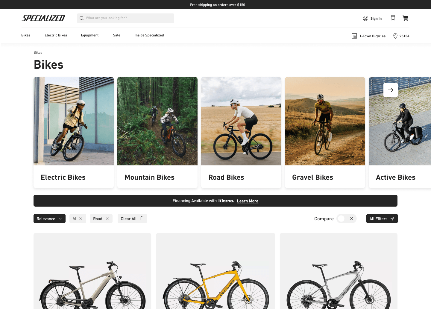
Bikes
Turbo Vado SL
Commuting / FitnessTarmac
Performance RoadCreo
Endurance / E-RoadDiverge
Gravel / AdventureStumpjumper
Trail / MountainComo
Comfort / UtilityKey Design Features
Problem Framing
Rather than starting from visuals, I centered the work on a rider orientation problem: users needed help choosing a category before comparing individual bikes.
Triad Collaboration
I worked as a senior partner across product, stakeholders, and engineering to align on scope, success criteria, component constraints, and rollout strategy.
Scalable UX Pattern
The carousel was intentionally designed as a systemized pattern that could flex across the homepage and dozens of PLPs without fragmenting the experience.
Implementation Quality
My engineering background helped close the loop between design intent and shipped quality, especially around responsiveness, hierarchy, and reusable component behavior.
Results
The feature performed because it solved the right problem. Riders got orientation earlier, merchandising gained a stronger storytelling surface, and the business saw measurable improvement in downstream shopping behavior. It became a successful global pattern rather than a one-page experiment.
- Rolled out from the global homepage to nearly 50 bike-related product listing pages
- A/B testing drove a 24% lift in conversion and stronger category engagement
- Average order value increased 9% as riders reached better-fit, higher-intent product paths sooner
- Revenue increased 12% after rollout across the highest-value bike discovery surfaces
- Established a reusable merchandising and navigation component for future category experiences
- Stakeholders saw it as a strong example of UX directly influencing revenue, not just presentation
- The pattern gave merchandising a clearer place to tell the category story without hijacking the page
- Engineering benefited from a more reusable and predictable component model
- The work strengthened my position as a senior triad partner operating across strategy, design, and delivery